STATurday: Visualizing the MBTA
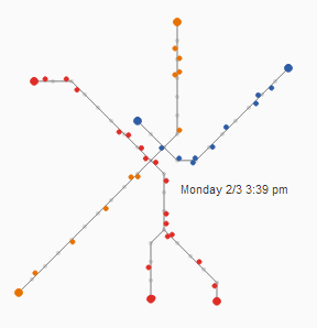 Earlier this month a couple of dedicated Worcester Polytechnic Institute students put together some visualizations of Boston’s MBTA’s movement of people around the city. They have charts showing the on-time performance of trains. They have interactive items to see where your particular commute falls in the grand scheme of things. And they have all the stations ranked by how busy they are with people going in and out.
Few things to note: This data is for 1 month: February 2014. There is no info on the Green Line (not provided by the MBTA — They’re probably afraid to see how bad it really is) or the Commuter Rail (they focused on subway), which is sad, because I think those 2 lines are some of the worst offenders.
If you’re a software person and really want to know how these guys got this all set up, check out their handout.